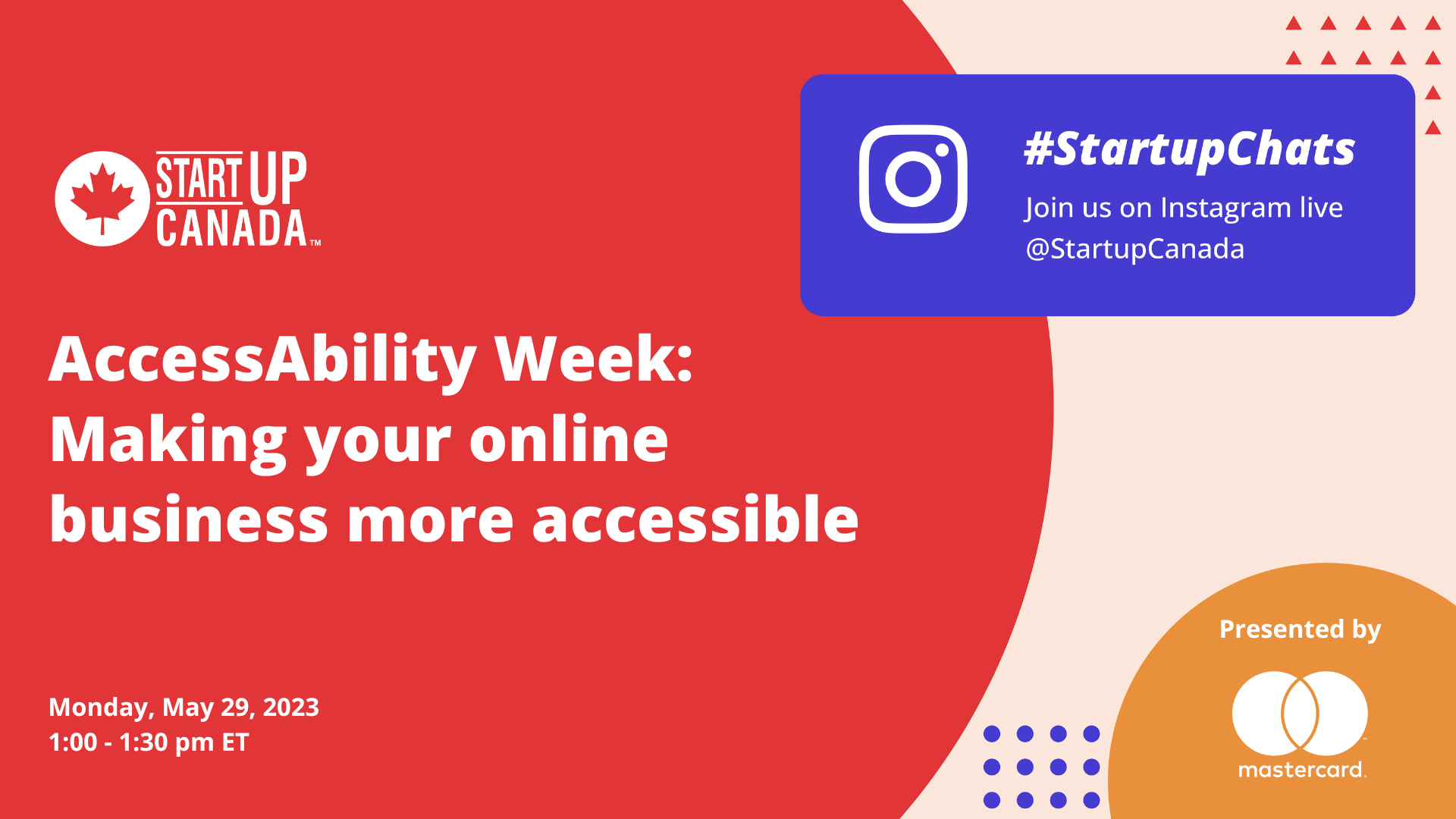
On Monday, May 29, we hosted a special AccessAbility Week edition of #Startupchats – discussing tips and recourse for making your online business more accessible. This #StartupChat discussion was presented by our partners at Mastercard.
Hosted by Startup Canada, we were joined by Scott Vinkle, Accessibility Specialist at Shopify and Izzy Camilleri, Founder & Chief Designer at IZ Adaptive. As an accessibility specialist, Scott was able to provide great insights and tools for entrepreneurs who may not be as familiar with building accessibility platforms. Izzy was able to provide stories and insights into how her team at IZ Adaptive has prioritized accessibility in both their clothing designs and their customer relationships and overall user experience.
Here are some of the insights and recommendations from the discussion:
- Scott: Digital accessibility specifically is about making products, websites, and apps useable for those who use assistive technology. Accessibility makes for better products for ALL users. To highlight four points that accessibility practitioners and leaders try to share every day:
-
- Accessibility is an evolving practice; it never ends.
- It must directly involve people with disabilities, the true experts in this field.
- Accessibility must be included throughout the entire product creation lifecycle; supercritical for saving time and money (because implementing accessibility best practices after the fact is very expensive).
- And finally, accessibility is innovation.
- Izzy: In starting IZ Adaptive, I had been doing some custom work for a woman who is a wheelchair user, and I didn’t realize the unique challenges she had when it came to clothing. I knew she couldn’t be the only wheelchair user with this problem. For our online store, our customer is really important to us. I wanted to make the website easy to navigate and see and ensure the navigation was not complicated.
- Scott: The AODA (The Accessibility for Ontarians with Disabilities Act) measures accessibility using the W3C’s Web Content Accessibility Guidelines, or “wuh-cag” for short. WCAG is pretty much the industry standard for testing for accessibility success criteria. A few specific things to watch for include:
- Keyboard accessibility; anything that can be done with a mouse must also be accomplished by using a keyboard.
- Labels; make sure links, buttons, and form controls are properly labelled and share appropriate context for their purpose.
- The heading structure is visible and in a logical order; this is very important for screen reader heading navigation.
- The high colour contrast of text and links form input borders for anyone with a low-vision impairment or who’s trying to read their phone out in the sunlight.
- Images feature context-appropriate text alternatives.
- Captions for video content for anyone with a hearing impairment or who’s in a loud/quiet environment.
- Izzy: When we make something accessible, it makes things easier for everyone. We tried to have our customer support person be a person who uses a wheelchair. Sometimes people want to know that the person on the other end has a shared lived experience as well.
- Scott: Don’t do nothing. Don’t ignore accessibility and assume it will go away on its own.
- Izzy: Listen to your customers.
Here is a list of accessibility tools and resources mentioned by Scott:
- Tilting The Lens: And Ongoing Commitment to Accessibility
- The WebAIM Million: The 2023 report on the accessibility of the top 1,000,000 home pages
- Design Delight from Disability – 2020 Annual Report: The Global Economics of Disability
- The World Health Organization 2020 Annual Report: The Global Economics of Disability
- Ontario.ca: How to make websites accessible
- Ontario.ca: Completing your accessibility compliance report
- Accessible Canada Act
- The Americans with Disabilities Act (ADA)
- European accessibility act
- W3C: Developing an Accessibility Statement
- Stark for Figma: Supercharge Accessibility
- Figma: Accessibility Annotation Kit
- axe DevTools – Web Accessibility Testing
- WAVE Evaluation Tool
- ARC Toolkit
- Fable: Digital accessibility powered by people with disabilities
Watch the recording
Missed the chat? Click here to watch the recording!
View this post on Instagram
Don’t Miss Out!
Register for upcoming #StartupChats by clicking here.
